

Matching newborn photography props can feel frustrating — especially when things almost match, but not quite.
Colours look similar… until you put them together. Textures don’t behave the way you expect. And setups that looked good in your head suddenly feel off in camera.
That’s usually not a styling problem. It’s a system problem.
👉 In practice, you don’t need more props.
👉 You need a small number of pieces that work together.
And it starts here:👉 You need 2–3 backdrops.
These become your setup bases.
From there, everything else becomes much easier.
How to Match Newborn Photography Props (Simple System)
Matching newborn photography props is about building a cohesive session using:
- 2–3 backdrop bases
- one consistent colour direction
- controlled textures
- small changes instead of constant rebuilding
👉 You’re not creating a new setup for every photo.
👉 You’re creating multiple looks from each base — and then moving to the next one.
This is what makes setups feel consistent, natural, and easy to work with.
Start With a Backdrop — The Foundation of Each Setup
Each setup starts with one thing:👉 the backdrop
It defines:
- the colour palette
- the mood
- how the image will feel
In most sessions, photographers work with:
- 2–3 backdrops
- each used as a stable base for one part of the gallery
Once the baby is settled, that base usually stays in place — and everything else is adjusted around it.
That’s why choosing the right backdrop matters so much.
A good backdrop gives you:
✔ predictable colour
✔ easy control (stretch + clipping)
✔ a clean base for multiple shots
✔ less fixing later
👉 Explore newborn photography backdrops
👉 Learn how to choose the right one → How to Choose the Best Beanbag Backdrop for Newborn Photography
Why Matching Props Matters
Matching isn’t just about making things look “nice”.
It affects your entire session:
- fewer decisions while shooting
- less second-guessing
- fewer colour corrections later
- more consistent galleries
The real goal isn’t perfection. → It’s control.
When everything works together — you don’t have to think about it.
👉 Read more: One Base, Multiple Frames: A Simpler Approach to Newborn Setups
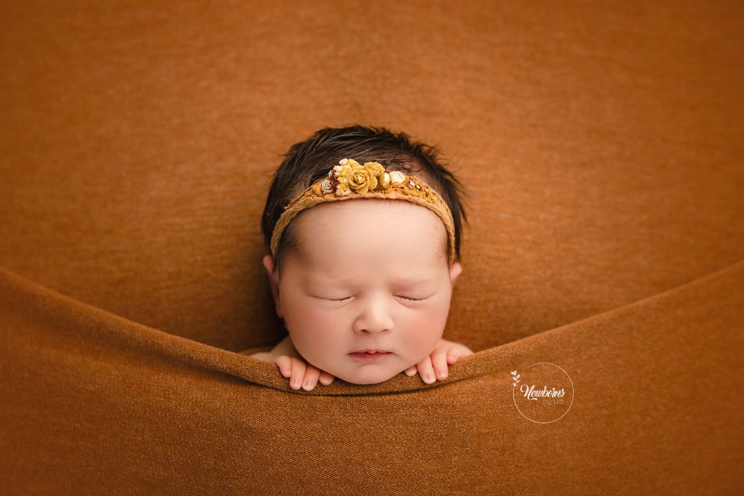
Image by Olga Tsybenko (olga_milkystudio) with our Stella Capsule Set (colour light beige)
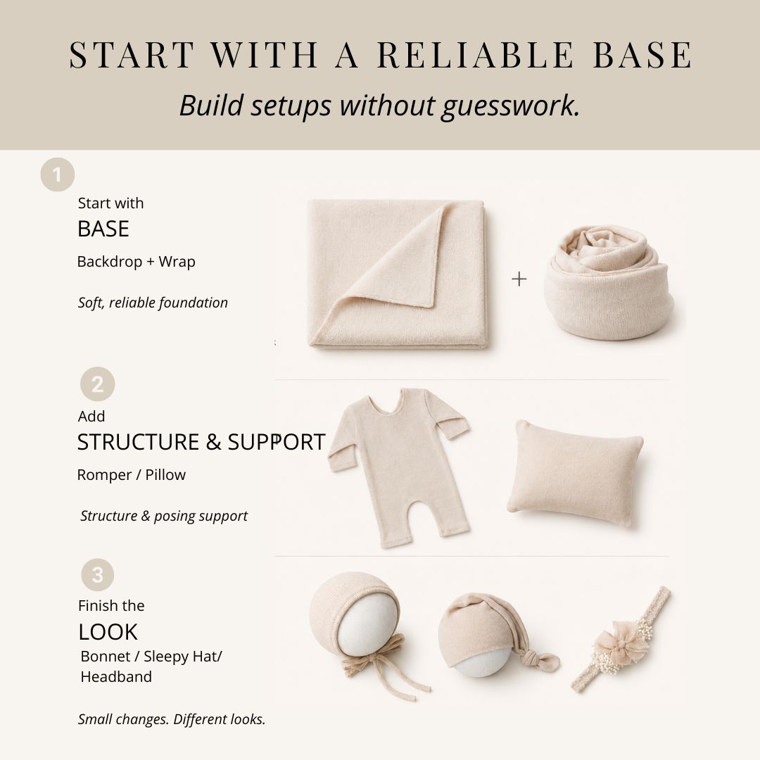
The 3-Step Matching System (Used in Real Sessions)
Step 1 — Choose Your Backdrop Base and Wrap
This is your starting point.
Pick:
- a colour
- a tone
- a texture direction
👉 Keep it simple:
- neutrals (beige, cream, soft grey)
- muted tones (sage, dusty pink, warm taupe)
💡 One tone = easier styling + cleaner results
Step 2 — Add Soft Structure (Not More Colour)
Depth comes from texture — not from adding more colours.
Example combinations that actually work:
- smooth + smooth (clean, minimal, timeless)
- smooth backdrop + textured wrap (subtle depth)
- textured backdrop + smooth wrap (balanced)
- knit backdrop + simple wrap (cozy, warm)
- one tone + layered textures (premium look)
👉 You don’t need contrast — you need consistency.
👉 Read more: best fabrics for newborn photography backdrops
Step 3 — Create Variety with Small Changes
This is how you build a full gallery without rebuilding your setup.
Instead of changing everything:
- switch headband ↔ bonnet
- add/remove a top layer (cheesecloth / gauze)
- adjust fabric around the baby
- change your crop (wide → close-up)
👉 One setup → multiple images
Then you move to your next backdrop base and repeat.
What a Cohesive Newborn Setup Actually Looks Like
A cohesive setup doesn’t mean using more props.
In most sessions, photographers work from one stable base and build gentle variation around it — using layers, textures, and small finishing details.
This keeps the gallery consistent without constantly rebuilding the setup.
This makes setups easier to style, easier to repeat, and much less overwhelming during the session.
What Is the Easiest Way to Match Newborn Photography Props in your Session?
Keep it simple:
- choose 2–3 backdrops
- stay within one colour family
- limit textures
- use small changes for variation
This gives you:
✔ consistency
✔ speed
✔ less stress during the session
Common Mistakes (That Break the Look)
❌ Too many colours
❌ Mixing tones from different shops
❌ Too many textures in one frame
❌ Strong patterns near the face
❌ Changing the base too often
👉 The biggest issue: No clear base to build on.
Why Matching Sets Work So Well
When props are designed to match:
- colours align naturally
- tones don’t clash
- textures work together
- styling becomes predictable
👉 You don’t have to figure it out.
👉 It just works.
How This Improves Your Workflow
In a real session, you don’t want to:
- reclip the backdrop
- rebuild your base
- rethink colours every time
You want:
✔ a stable setup
✔ quick variations
✔ minimal disruption
Matching props give you:
👉 one base → multiple shots
👉 fewer full changes
👉 more control
👉 Not sure what size backdrop to choose? Read: What size backdrop to choose
Final Thoughts
Matching newborn photography props isn’t about having more. It’s about having a system that works in real sessions.
When your base is clear, your tones are consistent, and your changes are controlled:
✔ your workflow becomes easier
✔ your setups become more predictable
✔ your gallery becomes more cohesive
👉 And you can focus on what matters most — the baby.
Explore Matching Newborn Photography Props
→ Explore Backdrops & Matching Pieces
→ Browse Complete Sets
FAQ — Matching Newborn Photography Props
How many backdrops should I use in one newborn session?
Most photographers use around 2–3 backdrops in a session.
Each backdrop becomes a base for one part of the gallery. From one base, you can create multiple images using small changes — before moving on to the next setup.
What is the easiest way to create a cohesive newborn setup?
Start with a backdrop, choose one colour direction, and limit the number of elements.
Then build variation through small changes like wraps, headbands, or layers — instead of changing everything.
Why do my props look different together than expected?
This usually happens when items come from different sources and tones don’t match exactly.
Even small differences in undertones (warm vs cool) can create a mismatch — especially in neutral colours like beige or grey.
Using props designed to match, or working within one tonal palette, helps avoid this problem.